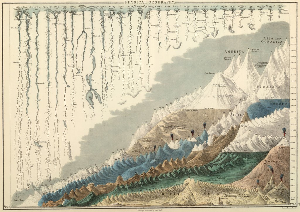
Victorian Infographics
by Austin Brown
Jan 11, 02011
These Victorian infographics take a beautiful, hand-drawn approach to the presentation of various geographic and astronomical data. The image above was published in 1854 and compares various mountains and river systems side-by-side.
Don’t miss the Tableau de L’Histoire Universelle, which represents nations and empires as rivers flowing through history and plenty more at BibliOdyssey.
(thanks to a new member Marianna!)
Join our newsletter for the latest in long-term thinking
Subscribe